100 Leadership Lessons
InDesign
〰️
Layout and Formatting
〰️
Typography
〰️
InDesign 〰️ Layout and Formatting 〰️ Typography 〰️
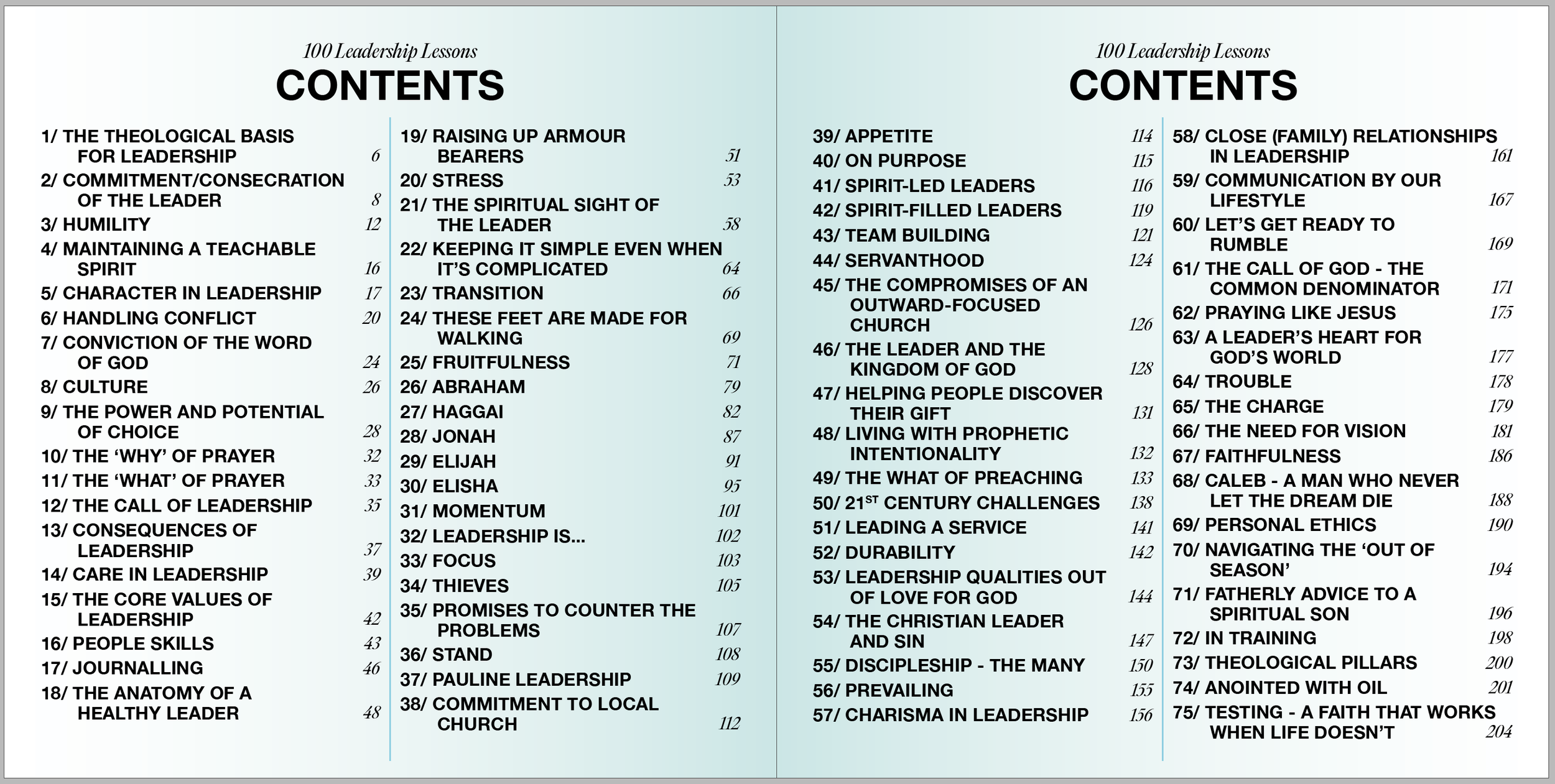
A personal passion project. 100 Leadership Lessons (by Phil Pye) was originally only supposed to be a simple Google Doc or PDF that I helped put together.
As I began to read and really understand the quality of the content, I realised it was deserving of so much more.
So I spent months designing this book, unbeknownst to Phil, printed it in a hardback cover and presented it to him on Christmas.
The quality of the content deserved a high quality design and finish.
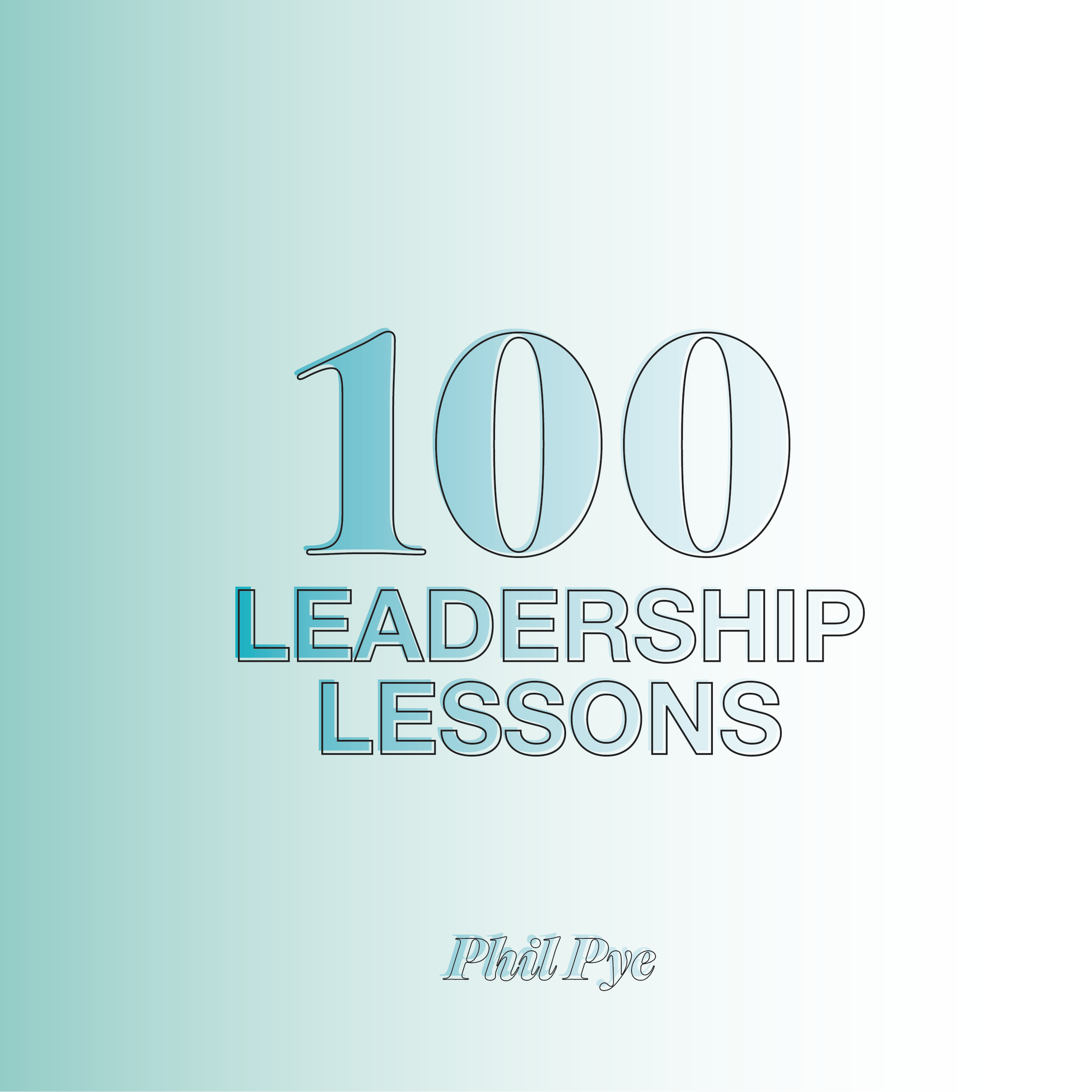
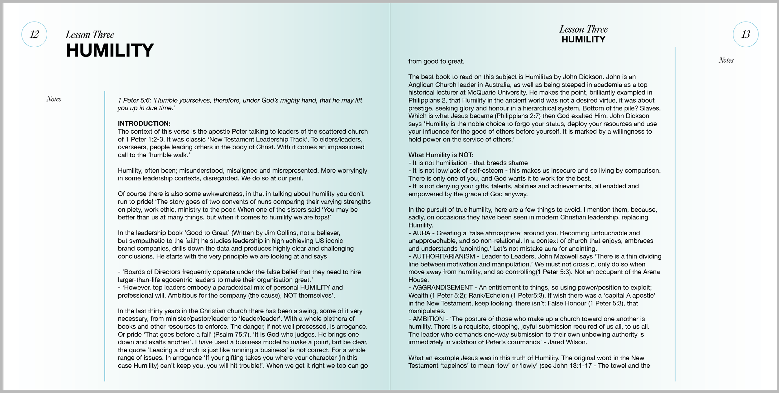
Final product printed 210mmx210mm, hardcover with matte soft touch lamination and 130gsm uncoated/writable paper for the inside pages.
The aim of this project was to create a product that felt worthy of its content. A hefty ‘coffee table’ style book with sophisticated, readable design and space to (inevitably) take notes.
The author had a particular fondness of the font Helvetica, which was used throughout in Title, Header and Body. The soft gradient inside burst out from the spine to give the whole book a warm glow.
GET
READY
OPPORTUNITY
WAITS
TAKE
HOLD
Typography
〰️
Motion Graphics
〰️
Photography
〰️
Typography 〰️ Motion Graphics 〰️ Photography 〰️
G.R.O.W.T.H
Branding Project
Stage One:
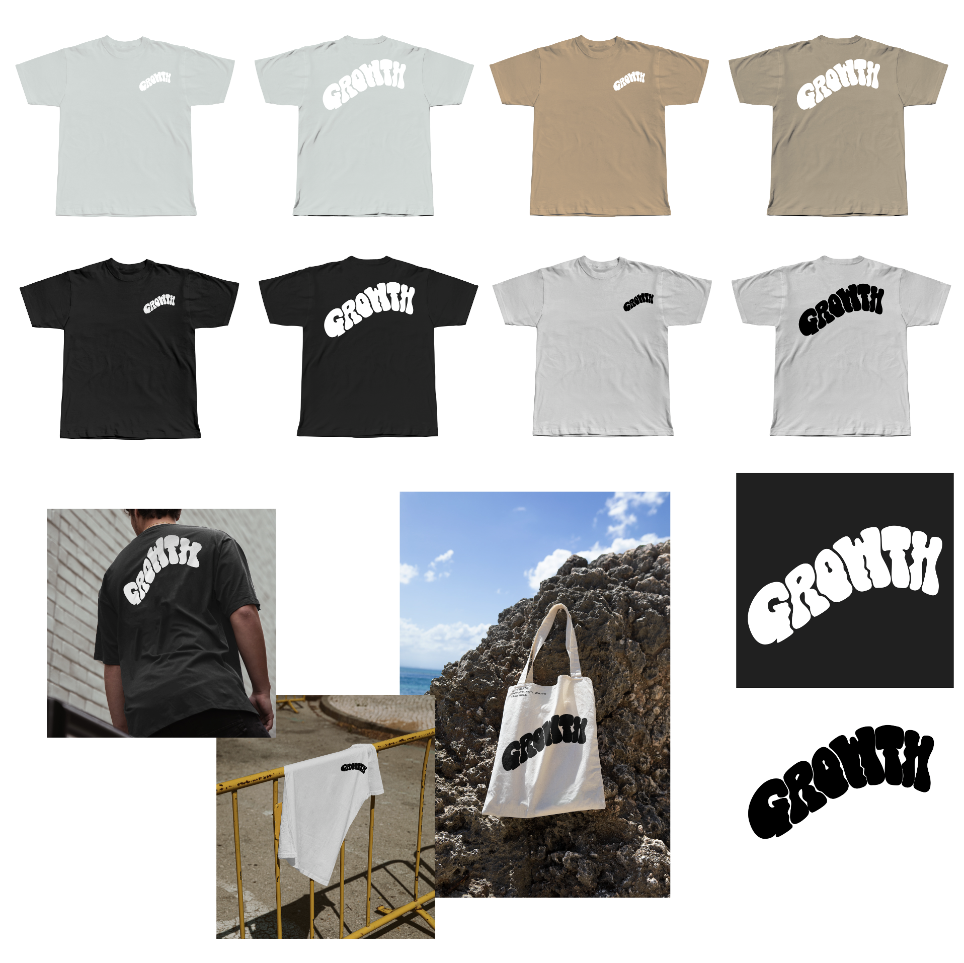
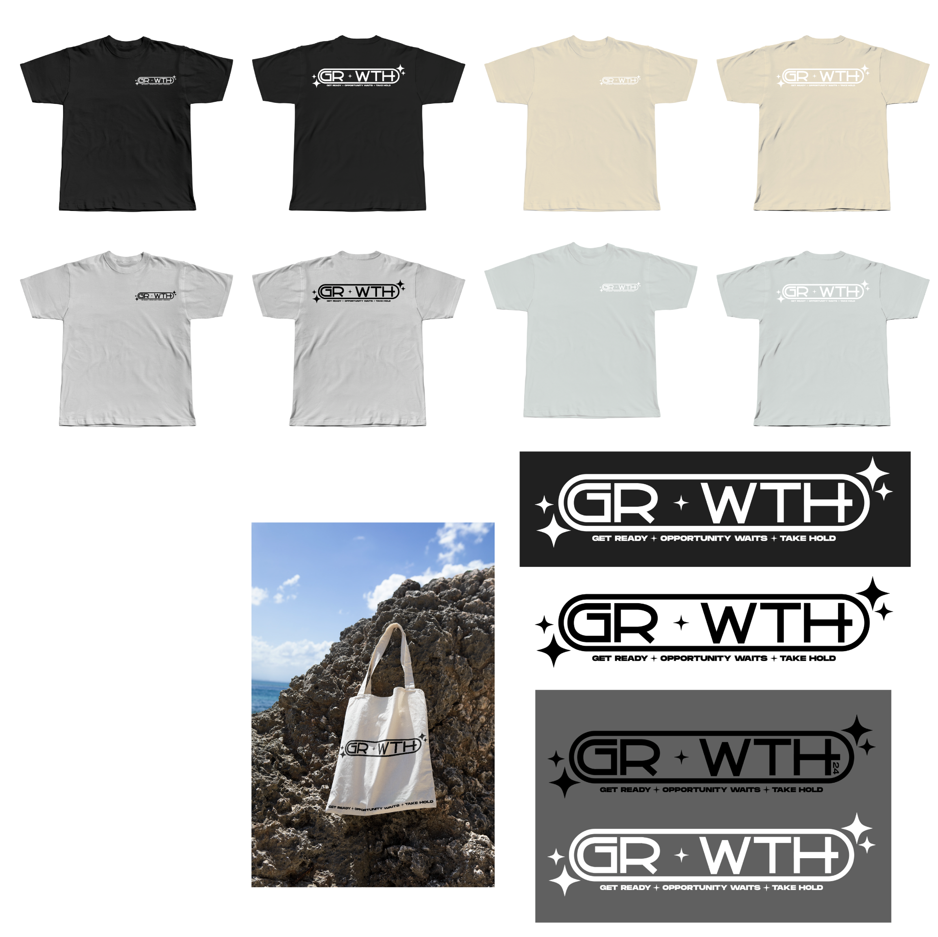
Mood boards and Mockups
Stage Three:
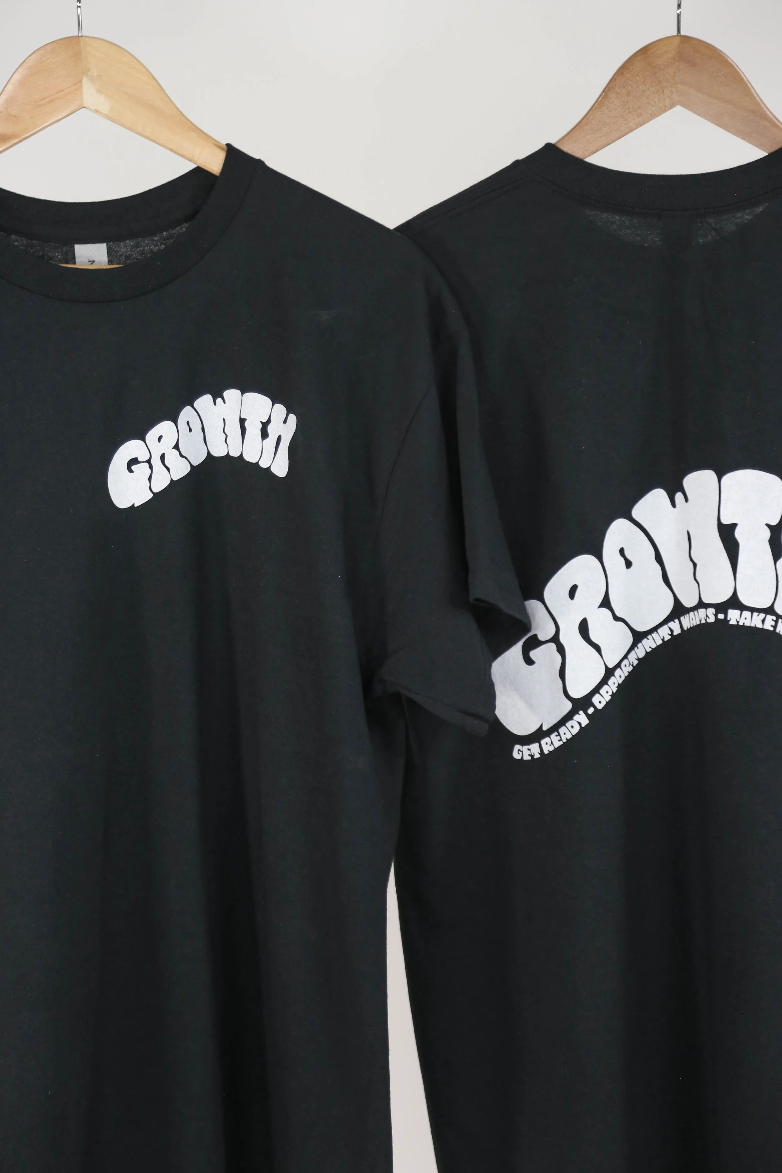
Promo
Stage Two:
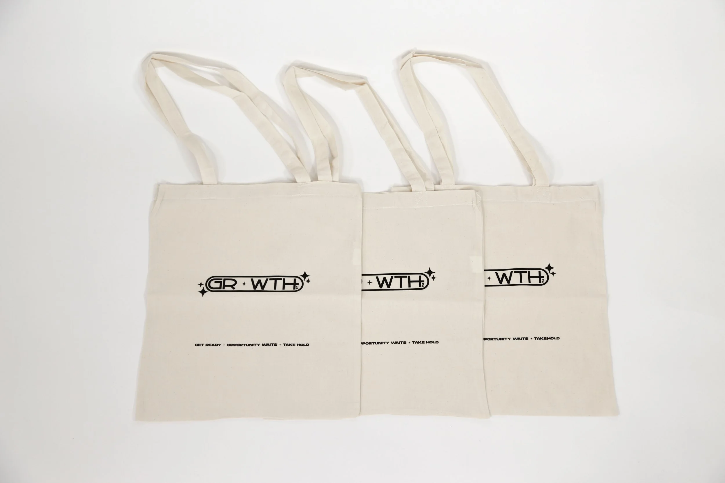
Final designs

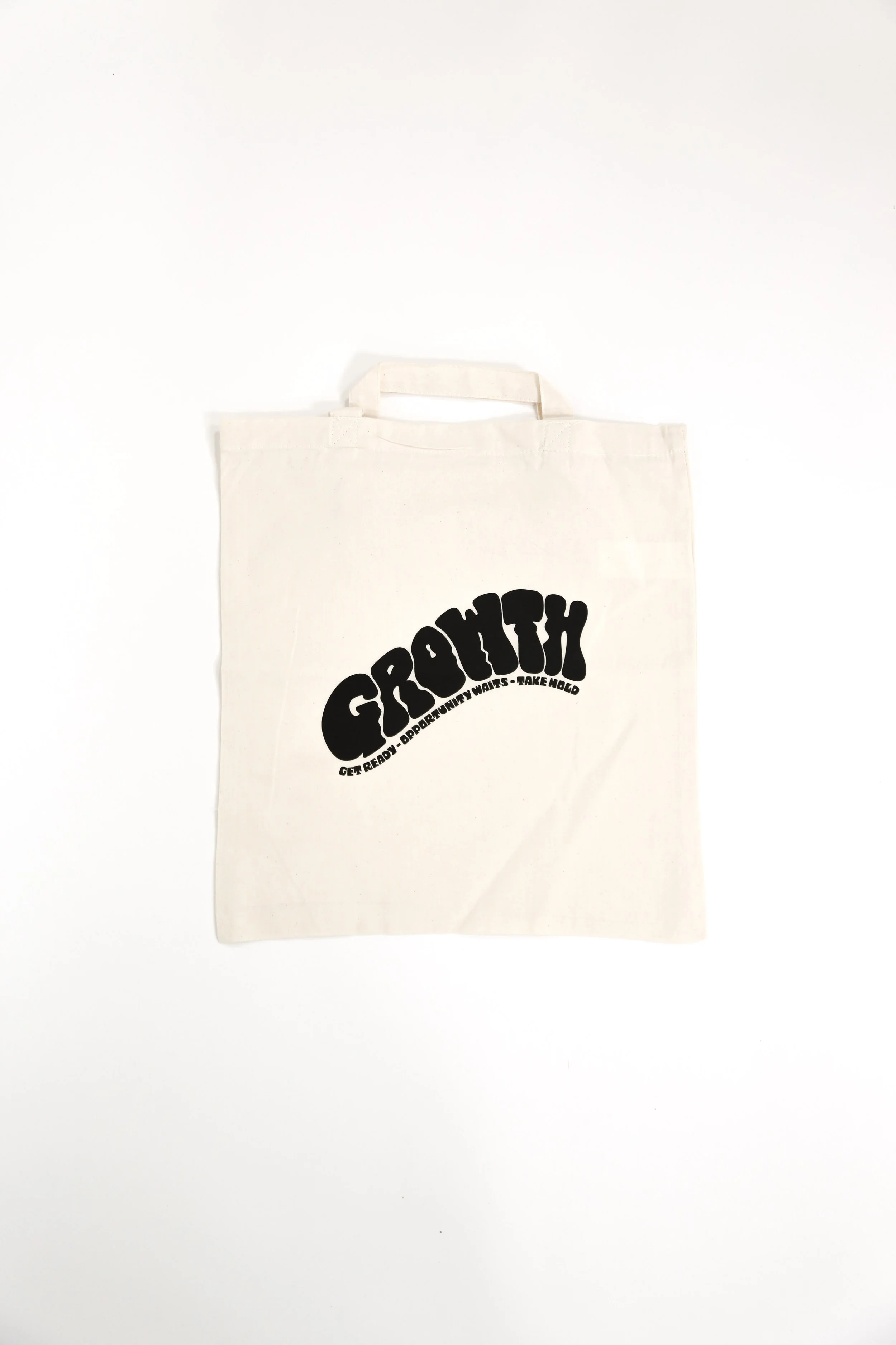
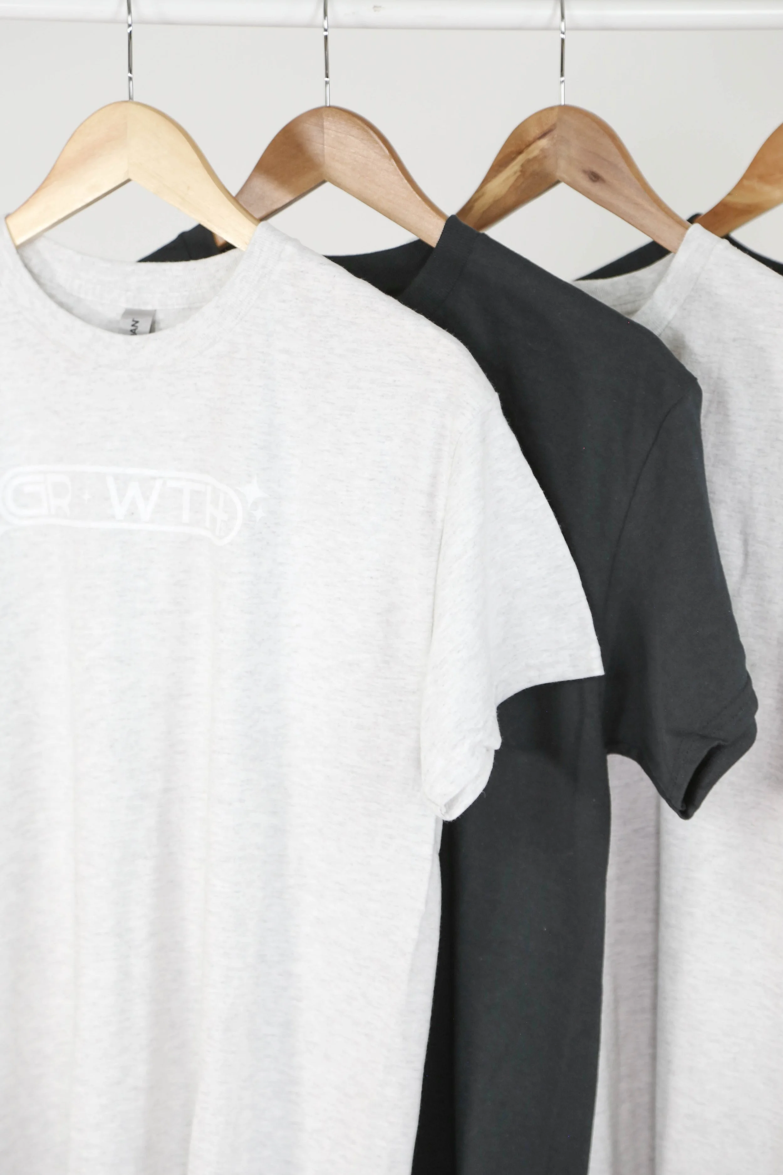
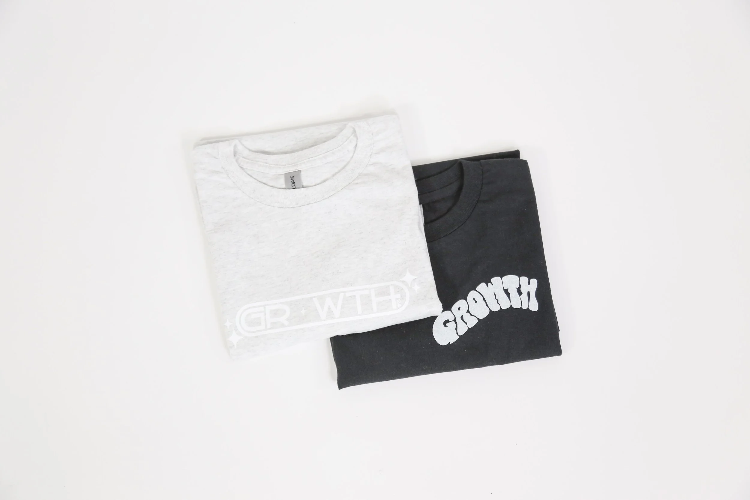
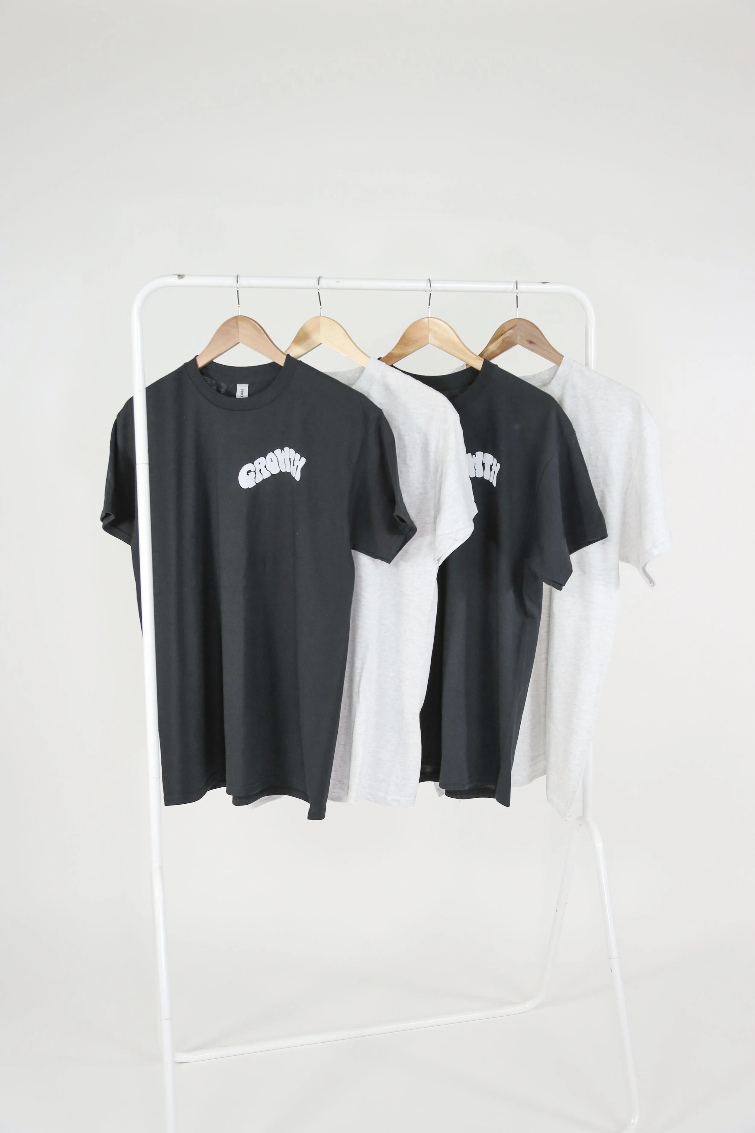
GROWTH was more than the word for the year, it was a re-igniting. A call to the church to seize the opportunities 2024 would bring.
The goal of this project was to create a Growth ‘movement’. A wearable reminder ti commit to growing daily.
The final products, logos printed on T-Shirts and tote bags, accompanied digital assets.
The project was a demonstration of a range of skills in illustration, typography/type creation, and motion graphics using Adobe After Effects.